How to identify key activation points and use it to improve your onboarding?
80% of your users leave after they sign up. Use this step-by-step guide to improve your product onboarding, so you can engage and retain them.


It's common to lose 80% of your users within 3 days. Heartbreaking isn't it?
I don't know about you, but this number keeps me up at night. You spend so much effort and money in bringing them to your website and sign up for your product.
All for what? To lose 80% of them?
Even a small improvement in activation can make a huge difference to the end goal.
For example, for a hypothetical app that's getting 60,000 users to sign up, let’s compare an activation efficiency of 5% with 20%:
- 5% activation: a total of 3,000 active users
- 20% activation: a total of 12,000 active users
That's a lot of potential growth you're likely missing on.
Of course, identifying how to activate users isn't a walk in the park either. It's one of those things you identify through a series of experiments and validating (or invalidating) multiple hypotheses. And a lot of guesswork.
However, if you have even 100 customers, you can remove the guesswork out of your activation campaigns and improve your metrics.
And this step-by-step guide is all about helping you achieve just that!
1. Define the end goal
Because how do you start optimizing for something without knowing what to optimize on?
Sure, you want to improve your activation. But to achieve what?
At the end of the day, there is one thing that you care about — the reason you are even investing time and effort.
Imagine you have a SaaS product. Your objective for the quarter is to increase the number of customers who are retained. But we need to define what retained really means.
Let's say it means using the product for greater than 1 month. That gives you a specific goal to work towards, where you can come up with a binary answer of "yes" or "no" when you look back and ask yourself if you were successful in achieving your goal.
2. Map your best customers' usage
Most businesses even after acquiring few customers still run their onboarding email sequences based on either gut feeling or based on what customers say.
While you must listen to what they say, you must also know what they do. The advantage of having even a few customers is you can see exactly what they did and what it led to. Did it lead to the desired outcome? Or did it lead to a different behaviour? Or did they drop off?
By creating a Sankey diagram of the top paths customers take within your product, you can gain insight into how users sequentially perform events in your product and identify where they drop-off. If you’re using a tool like Mixpanel or Amplitude, you should be able to get this data.
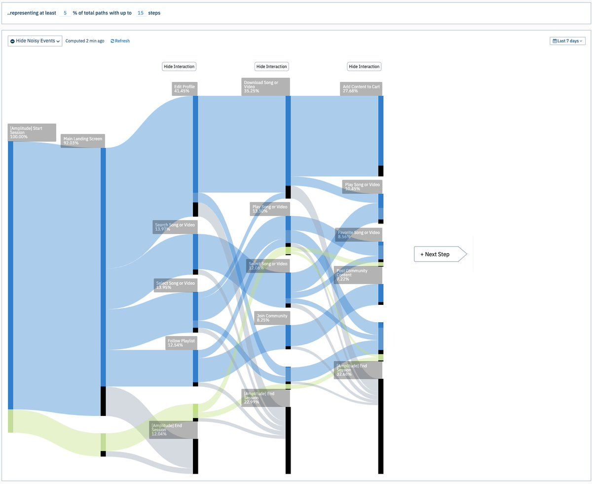
There’s a good chance you'll have multiple paths within your product. After all, your user’s journey is rarely linear. Which is why it is best to pick one path — most frequently used by paying customers — and work your way from there.
3. Identify the correlation between each event and the goal
Now that you know the events your best customers perform and the path they take, let's asses the impact of each event on the goal.
When looking at data, most teams say, “people who performed X converted” or “people who converted did X”. They make the mistake of not considering people who performed X but didn’t convert, nor do they take into consideration the people who converted without performing X. This is a typical example of first-order thinking.
By using the Phi coefficient, we can take a multi-dimensional approach to find if there is any relationship between a specific event within your product and the number of occurrences of a feature usage that is likely to maximize the outcome.
By digging into your analytics tool or your database, you should now be able to fill in the cells a, b, c, and d into the 2x2 matrix table below:
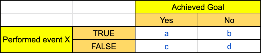
where,
X = a specific event from the Sankey diagram you identified from the previous step.
a = the number of people who performed the event AND achieved the goal.
b = the number of people who performed the event AND did not achieve the goal.
c = the number of people who did not perform the event AND achieved the goal.
d = the number of people who did not perform the event AND did not achieve the goal.
Using this data, you can then find if a specific event has any impact on the goal using the below formula for Phi’s correlation coefficient:
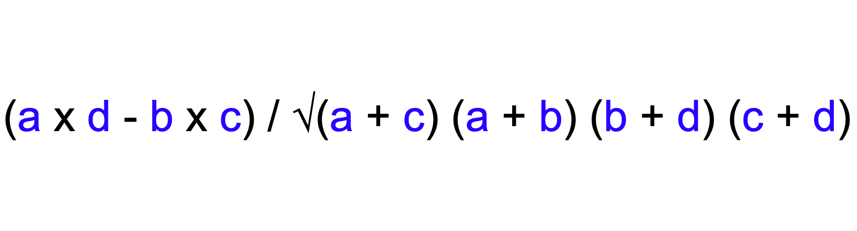
The value you get can vary between -1 and +1. Here's a breakdown of how you should interpret the values:
- exactly +1.0: a perfect positive relationship
- between 0.21 and 1.0: positive relationship
- 0: no relationship
- between -0.20 and +0.20: weak relationship
- between -0.21 to -0.70: a negative relationship
- exactly -1: a perfect negative relationship
Now that we know the impact of a specific event to the goal, you can repeat this process for all the other events you determined from the Sankey diagram and see how all the events' impact stack up against each other.
Below is a sample example of how it might look:
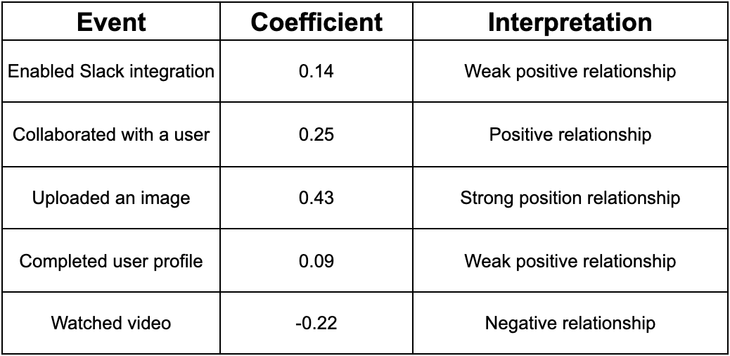
From the above tabular column, it is evident that the event "Uploaded an image" has the strongest relationship to the goal.
Next steps
You can tweak your app's onboarding flow and email campaigns to nudge users to upload an image to reach your goal of making customers use the product for more than one month.
After implementing the new onboarding flow and email campaigns, if you achieved your one month retention, you can repeat the process to hit your two month retention or any other goal.